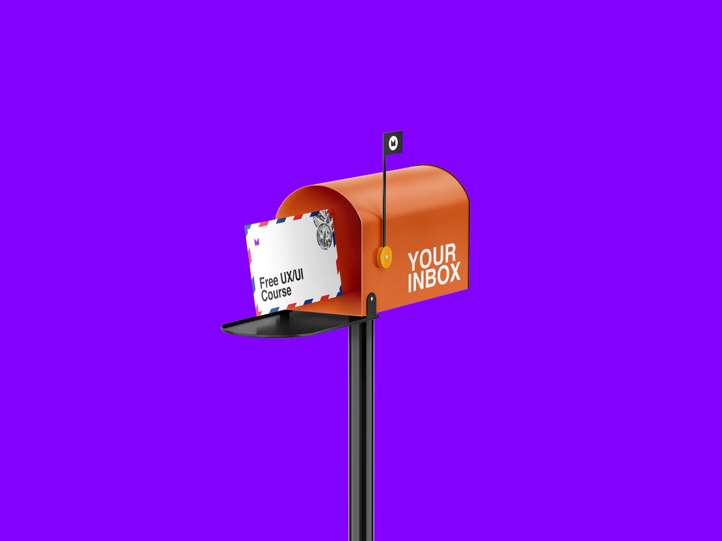
Get a Free UX/UI Course in Your Inbox Every Day for 15 Days
By the end of this three-week crash course, you'll have a much better understanding of the tech industry, the design craft, and all the knowledge you need to start building your career.
Navigating Pitfalls: 4 (More) Common Mistakes to Avoid in Your UX Portfolio
By
Raluca Angelescu
June 26, 2023
•
No read
Share this post
We all have moments of introspection where we examine our past work. Lately, I've been talking to other aspiring Designers and reminiscing about my UX portfolio. I've penned an article on this topic before, but after this new series of conversations, it struck me that a follow-up was in order.
So, here it is - an exploration of four additional pitfalls to avoid in your UX portfolio, coupled with some tips on how to navigate around them.
Information Overload
As designers, we're no strangers to constant iteration, creating countless files and screens and immersing ourselves in in-depth research. When we step back and review our work, it's like looking at an extensive canvas of our abilities. It's only natural to want to display this to potential employers, as proof of our skills and capabilities.
However, this approach can sometimes backfire. The industry is constantly moving, like our schedules and commitments. So only a few recruiters and hiring managers have the proper time to go through everything.
So while a super exhaustive portfolio might seem like a testament to your diligence and dedication, it can inadvertently become an obstacle. It might overwhelm the viewer, distracting from the high points of your work, and worse, it could even lead to your portfolio being overlooked due to its intimidating length and complexity.
Here are some tips on how can you showcase "just the right amount of work":
Prioritize Visual Hierarchy: Give your portfolio structure with clearly defined headers and impactful visuals. These aspects not only cater to 'scanning' viewers but also allow you to present your design thinking and decision-making skills effectively.
Select your Best Screens: Pick the most compelling, impactful, and well-designed screens of your product. Showcase these "big" and narrate their creation story. This approach lets you share the best of your work without overwhelming the viewer with excessive detail. Avoid including all possbile mock-ups, from low-fi to hi-fi.
Be Unique: Avoid filling the page with common flows such as log-in screens. Instead, highlight elements that are unique to your app and best display your problem-solving skills.
Doing everything yourself
Many of us have been raised with the idea that using templates or getting inspiration is cheating or stealing, but things are different when it comes to elements and components that can streamline our work.
Many aspiring Designers tend to create all elements themselves, from buttons to templates in Miro, without checking or using industry standards for fear that they are stealing somebody else's work. While this demonstrates initiative, it can also lead to unnecessary workload and potentially overlook proven design solutions.
In this context, leveraging UI kits is not only allowed but also helpful. Here's why:
Streamlining Workflow: UI kits allow designers to focus on complex issues that require more attention and creativity, such as user research, problem-solving, or ideating new functionalities. By eliminating the need to create each element manually, designers can devote more time to these crucial aspects of the design process.
Expanding Design Vocabulary: Exploring and using well-crafted elements can enrich your design vocabulary. This practice is particularly beneficial early in a UX career when we don't yet have a gut feeling about spacing and visual hierarchy. It's not just about speeding up the process but also learning from the aesthetic choices made by more experienced designers.
Not showing impact
We sometimes get too lost in the process, so immersed in our work, that we assume all observers will inherently understand its significance and the impact it has on the product. But this isn't always the case.
A common oversight in many portfolios is not demonstrating the real-world effects of their work. It's not enough to outline a linear process of problem definition, research, and UI creation. What we need to ask is - how did those design decisions affect the clients or address the problem at hand?
Incorporating UX metrics is always a good practice, as they provide tangible evidence of your design impact. Whether it's user conversion, abandonment rate, or measuring satisfaction through Net Promoter Score (NPS), showcasing the results of your design decisions in a measurable way can significantly enhance your portfolio's value.
But what if you're showcasing a passion project and don't have any metrics to display?
No need to worry! You're not out of options. In such instances, you can hypothetically propose metrics that could measure the project's success if it were real. Discuss what you would measure and define what these metrics should look like for the project to be deemed successful.
Even without actual metrics, this approach demonstrates your ability to think critically about design impact and the importance you place on validation. It shows potential employers that you understand the significance of measuring design success and are proactive about incorporating this aspect into your work.
Not showing critical thinking.
We often hear certain numbers being thrown around in design processes - "conduct 5 user interviews," "create personas for your project," and so forth. The truth is, not every project requires these exact elements or steps. More importantly, what stands out in a portfolio is your ability to articulate and justify your design decisions and process steps.
A key shortcoming in many portfolios is a lack of demonstrated critical thinking. Design decisions appear to be based strictly on "rules to be followed" without clear rationale or adaptability to the unique needs of a project.
Critical thinking, a skill that's essential in UX design, involves questioning assumptions, exploring different perspectives, and deciding on the best approach based on the context. When you showcase this skill in your portfolio, you're showing more than your ability to follow a set process; you're demonstrating your aptitude for thoughtfully selecting and applying UX methods that best suit your specific case.
As such, your portfolio should do more than just present a standard, formulaic process. It should highlight the instances where you have deviated from the norm, adapted your approach, and made decisions based on the unique demands of a project.
This may involve explaining why you conducted more or fewer user interviews or decided against creating personas for a particular project. Such explanations provide valuable insight into your design thinking process and can be incredibly compelling for potential employers. After all, UX design isn't about strictly following a set of rules, but about understanding users' needs and delivering optimal solutions - and that often requires thinking outside the box.
In conclusion, the process of crafting a compelling UX portfolio involves more than just showcasing your work. It's about striking a balance between demonstrating your skills and not overwhelming viewers, making strategic use of available resources, showing the real-world impact of your designs, and demonstrating your critical thinking abilities.